News

Gallery 1
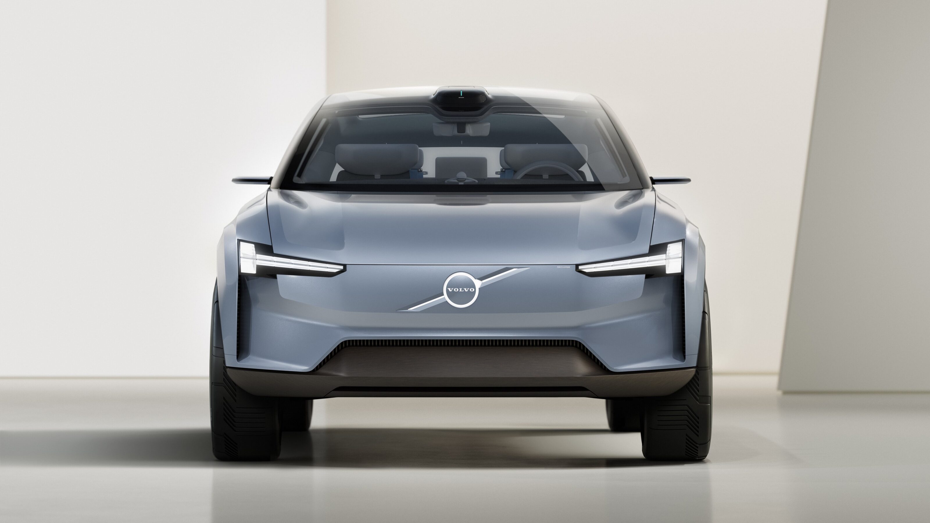
Swedish manufacturer Volvo has quietly debuted a new logo.
The latest iteration of the Iron Mark, first used in 1930, is a flat, 2D design as opposed to the existing logo – which appeared 3D even when presented on a screen, featuring shades to add depth and reflections of light.
Reverting back to its classic design, the new Iron Mark features no intersections of line or text, deleting its centre bar which is a departure from every version of Volvo’s logo since it was first established as a company.
1
Representing the element iron and the planet Mars, the Iron Mark is said to embody Volvo’s commitment to strength in its vehicles – all of which will be electric in the near future as the company gears up towards a sustainable future.
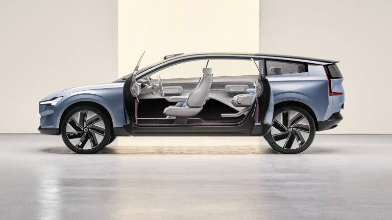
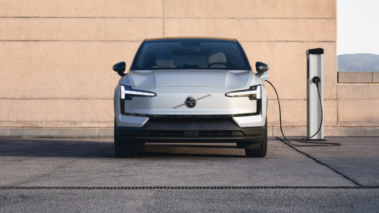
While the simple black and white logo is new, we’ve seen Volvo aiming for a more simplified design on the grille of the Concept Recharge – as the badge’s illuminated background and text bridges the gap between the past and future emblems.
1
MORE
All Volvo stories
We recommend
-
 News
NewsVolvo Concept Recharge interior revealed – UPDATE
Bringing operations in-house is starting to become Volvo's way forward
-
 News
NewsVolvo to ditch diesel ahead of EV-only by 2030
Volvo has taken another step away from internal combustion engines
-
 News
NewsVolvo will go leather-free in electric models
Even with recycled materials, Volvo aims to retain a premium interior experience