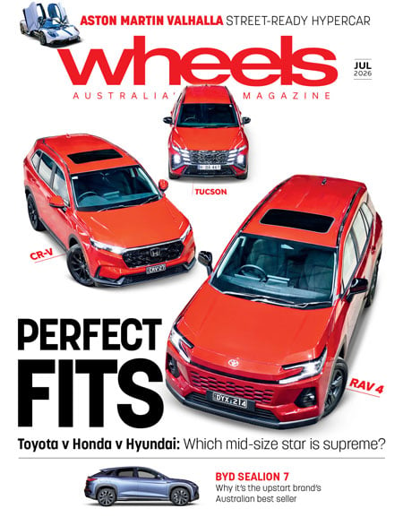
Features

Gallery 1
Open to the sun, but surrounded by breeze-blocking walls to prevent long-lens peeping from adjacent buildings, the roof of Mazda’s design headquarters in Hiroshima is a suntrap. The mid-July day in 2008 when Kunihiko Kurisu gives us an exclusive briefing on the design of the new Mazda 3 is a super-humid scorcher. But the chief designer, a compact, whippet-lean weekend road cyclist, never breaks a sweat as he talks about the car he’s worked on the previous four years.
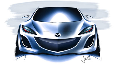
The PowerPoint presentation on the official style objectives for the second-generation 3 is predictable stuff. Even though it had been decided the new Mazda 3 was to be built on essentially the same body structure as the first, it was important to make it better looking. Kurisu uses stock vocabulary; the exterior needed to be more expressive, emotional and dynamic, the interior more stylish, sophisticated, dynamic and sporty. Only once we’re talking about the process of turning these words into metal, plastic and glass do things get interesting… “Centre focus” is his key phrase, and Kurisu is able to show how it applies, both inside and out. “All design elements are looking at the centre, concentrated on the centre,” he says. So the new 3’s exterior lines converge at its centre line, while the interior extends outwards from its centre.The big, five-point front aperture plays a key role in the exterior. Like a downward-pointing arrowhead it anchors the car to the road, at the same time as making it appear wider and lower (even though the changes in key dimensions are not large) and creating a family resemblance to other Mazda models.Kurisu admits there were concerns that customers might dislike the grille’s oversized prominence. Design clinics proved these were unfounded. And any similarities to Peugeot are purely superficial, he says. “In the case of Peugeot’s grille, it’s not a centre-focus grille. The plan view is quite flat.” Kurisu takes a pen and draws two lines to illustrate his point. Then he deftly renders the head-on views of a generic Peugeot grille and the Mazda 3’s. “The radius is quite big in the Peugeot treatment, it looks really quite organic,” he points out. “This is probably the nose of the lion, or something…”The crisp creases and emphatic surface work of Kurisu’s team of designers push the boundaries of what’s possible with stamped sheets of steel. In Mazda’s design process, clay models from the studio are repeatedly digitised and checked for production feasibility. The engineers weren’t always happy with what they saw. “The manufacturability was the issue,” admits Kurisu of his centre focus design theme.“We really had quite heated discussions between engineers and designers,” he says, pointing out the particular creases and hollows that were the subject of these talks. “But they worked so hard to make it happen.”The wheels designed specifically for the new 3 are intended to echo some of the body’s features. Taking up his pen again, Kurisu outlines and then shades a couple of wheel spoke designs. The twisted “tension in transition” design for the 3’s 16- and 17-inch wheels mimics the kick-up element in the car’s sides, he explains.Special attention was also paid to the detail design of the lamp clusters. “Customers are quite sensitive to those, you know,” Kurisu says. The bi-xenon headlamps with arrow-shaped sidelights, for high-grade 3 models, are quite striking. “No new technology, but it looks really new because we did something good there.”The car’s carry-over architecture – the body side apertures, for example, are the same – meant the designers were denied the opportunity to create a roomier, easier to access interior. Yet the interior does look and feel quite fresh.“The [gear] shift location, compared with the current vehicle, we just moved upward so that it’s quite dynamic,” Kurisu says. This welcome change meant particular attention had to be paid to other functions close by, including heater and audio controls. The solution was to curve the top of the centre console away from the front seat occupants, which made the interior feel more spacious.“The interior [colour] co-ordination, we mainly use black colours so that it looks really sporty,” he continues. Frequently used dash knobs are highlighted in silver for easier location. But only the lower part of the centre stack panel is silver-finished because of reflection issues discovered during development. And the centre stack itself was slimmed when testing showed front seat occupants wanted more room to spread their knees.There seems to be only one detail inside the new 3 that Kurisu would like to change. The designer admits he finds the red-glowing markings of the Mazda 3’s major dials hard to read without his glasses. “Personally, I wanted to [use] white colours instead of the red,” he says. Mazda has studies that show this is better for ageing eyes, he adds. “However, in this case we have to show some consistency with other vehicles. That’s how we decided on red colours…”
Follow WhichCar/Wheels on Google
Click the button below to make WhichCar by Wheels a preferred source for your news.